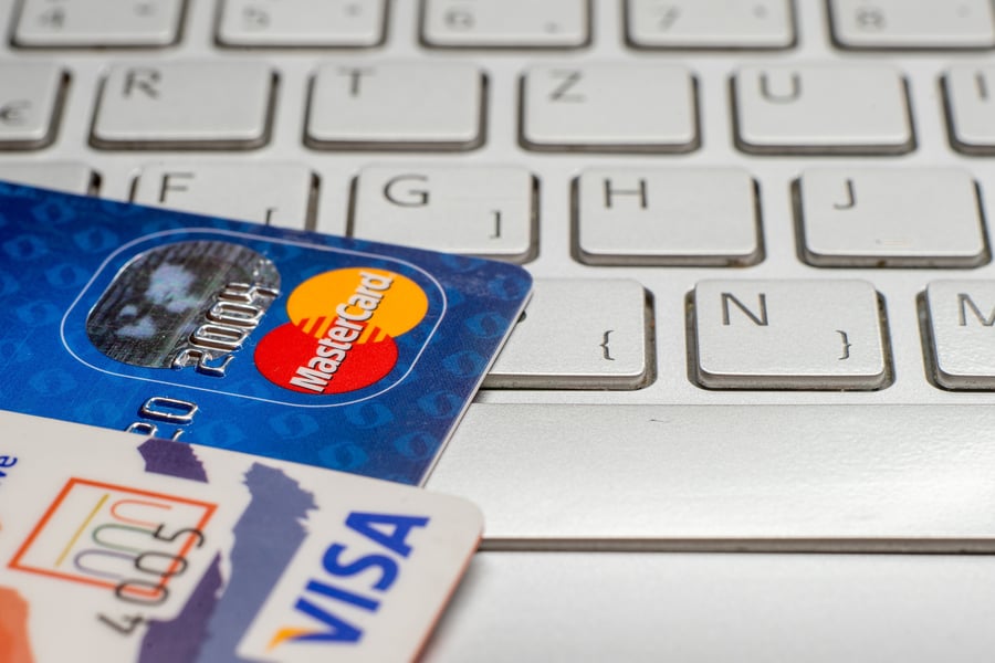
You may have read about a recent development in the ongoing online commerce wars. Visa and MasterCard announced plans to launch a shared pay button for online purchases, replacing their existing Visa Checkout and MasterCard Masterpass payment buttons. American Express also signaled its willingness to join the effort. The resulting changes could become visible on ecommerce websites as early as the 2018 holiday shopping season.
This change, of course, by the card networks has been interpreted as a sign of their discomfort with traction of competitors like PayPal in the fastest growing category of purchase transactions. It may be tempting to consider this a turf battle between a group of vendors – big and powerful as they may be – and to pay the matter limited attention from a distance. We’d encourage you to look closer, however, as the byproducts of this skirmish could have major implications regarding the future of digital payments.
Location, Location, Confusion
The idea of a single pay button is an entirely logical one. Real estate on a merchant’s website is a precious commodity and need not be cluttered with multiple pay buttons the way network logos (or “bugs”) used to litter the back of debit cards. What’s more, cardholders find them confusing. The average consumer may not even know if their card carries the Visa or MasterCard brand.
And that’s as it should be; the branding focus should be on the card issuer, hopefully your FI. Beyond that, the consumer simply wants to complete a transaction, not figure out which button they need to click. Imagine if separate Visa/MasterCard/American Express terminals were stationed at physical checkout lanes, standing at the ready depending on which card a customer chose to swipe.
From this point, however, the story grows more complex. Part of the pay button’s value is to store preferences and deliver a one-click fulfillment experience (or as close to a single click as possible). Creating such an experience involves setting certain defaults. Since most consumers carry multiple cards, the question of which card is granted default status (and how the networks arrive at that determination) will be of critical importance to issuers.
Not only do issuers want to ensure they maintain or grow transaction share, but they also want to ensure their transactions are profitable. There’s always the concern of transactions migrating to low- or non-revenue generating channels (as in the case of PayPal). Although a single pay button is meant to do just the opposite, any changes to this trend certainly bear watching. The pay button also serves as a rich source of behavioral data, access to which issuers will want a say in managing.
What’s In Your Wallet? (Not That One…)
FIs have wrestled with similar issues in recent years in deciding how to approach the emergence of digital wallets, which pose their own set of challenges regarding default card selection and appropriate brand visibility. The same thought process will likely apply to pay buttons, although the stakes are even higher. Therefore, it’s a good time for issuers to revisit and refine strategies for optimizing revenue across all digital channels.
The move to a single pay button holds promise for removing friction from the online shopping process, especially for marketing opportunities within social media environments. Solidifying payments volume in the rapidly growing e-commerce landscape is certainly a wise idea for card issuers. Inaction can have negative consequences, though, and it’s an added challenge to stay abreast of subtle moves by industry players that inject twists into the process.
There will absolutely be more to come on this front. The card networks haven’t even committed to retiring their existing buttons and moving forward together – it’s still an “exploration.” Watch this space….


